Los Angeles, CA. | 2021
Sigil concepts and title treatment for the popular book series, Eragon.
I’ve been fortunate to elevate my skills in logo marks these past couple of years.
Albeit unused concepts, these were super exciting to explore with Christopher Paolini!
Here’s my process and hope you enjoy viewing!
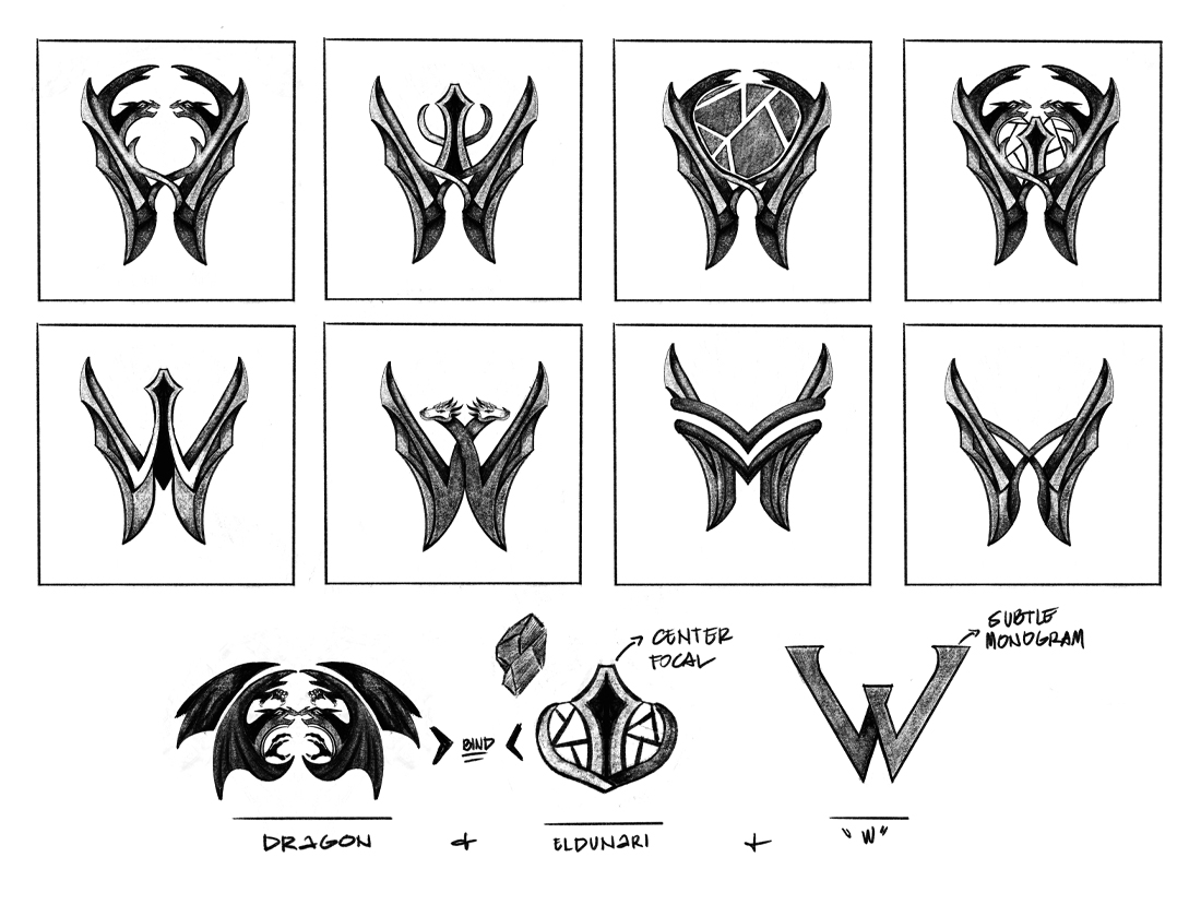
Dragon + Eldunarí + Palm-Shape “W” Monogram
Dragon + Eldunari + Palm-Shape “W” Monogram when Chris started pitching some inital cocepts,
he drew out quick sketches with a world surrounding Eragon. A clever take and we wanted to revisit but with a more
high concept of what it can potentially look like.
We incorporated the Palm shape “W” that holds what appears like Eldunari in a shape of a heart.
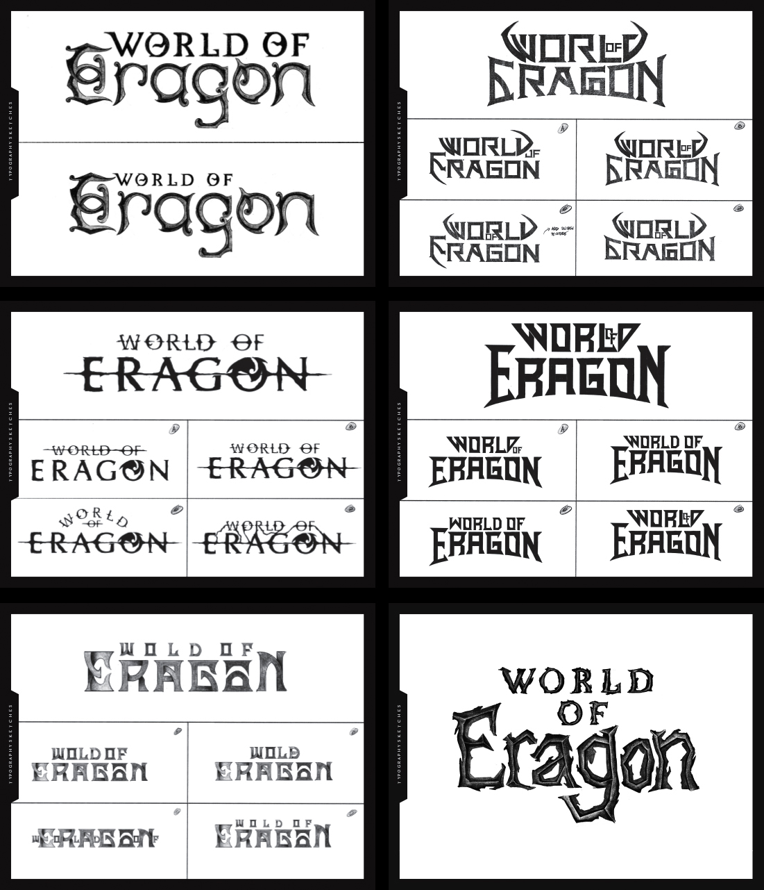
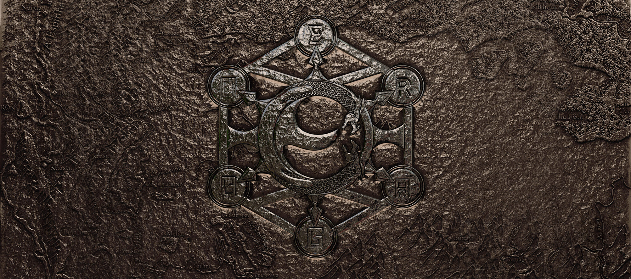
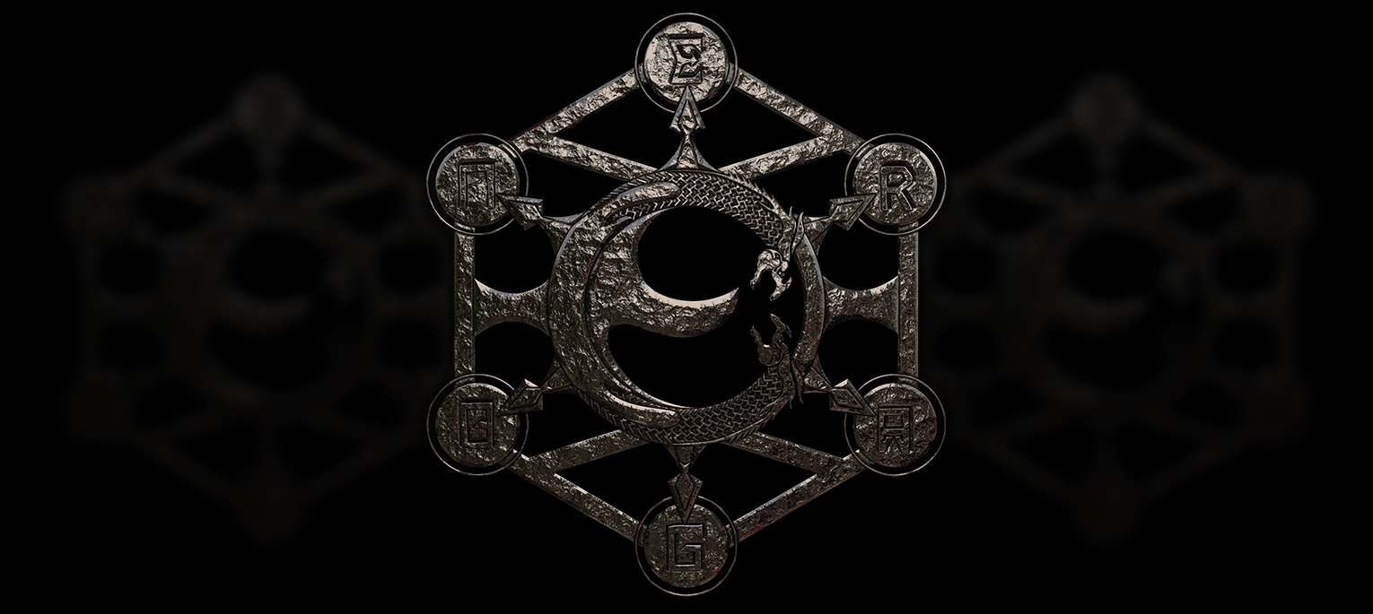
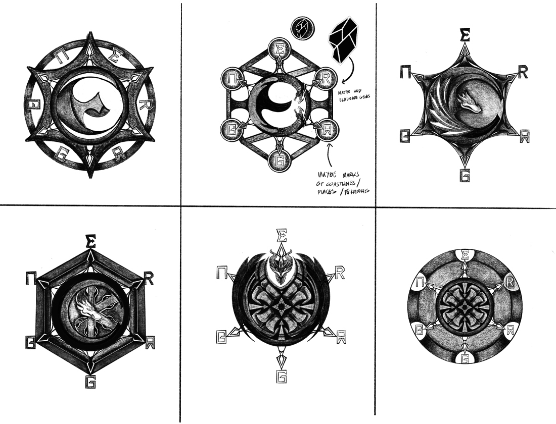
The Journey to the World of Eragon
Another aspect of introducing the World of Eragon is to navigate the world around it.
The conception of this piece stems from Chris’ idea to incorporate the map that comes from the book.
As we navigate through this, we can expand different symbolisms that introduces the World of Eragon
as additional aspect of the logo mark. This may be another expansion as we move forward with the project.
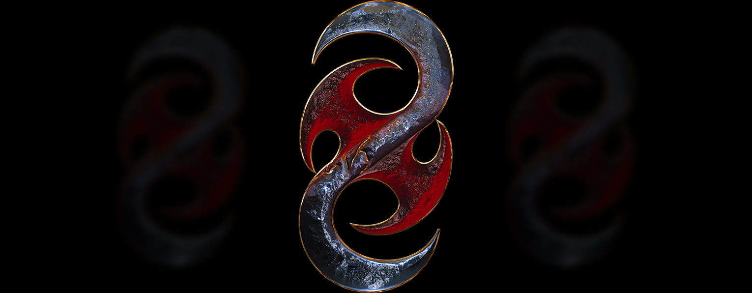
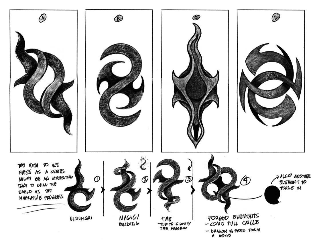
Brisingr Comes Full Circle
Incorporating a portion of the Brisingr and forged it into the piece was the inspiration for this concept.
In the midst of all the ideas that we brainstormed, Chris always came back to how important it
was of the relationship between the Dragon and its Rider. The idea is to collect aspects of what is
familiar and recognizable but still create something new.
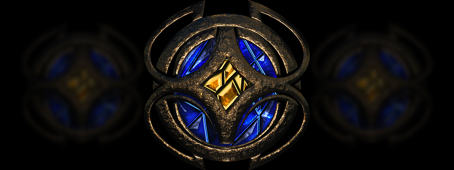
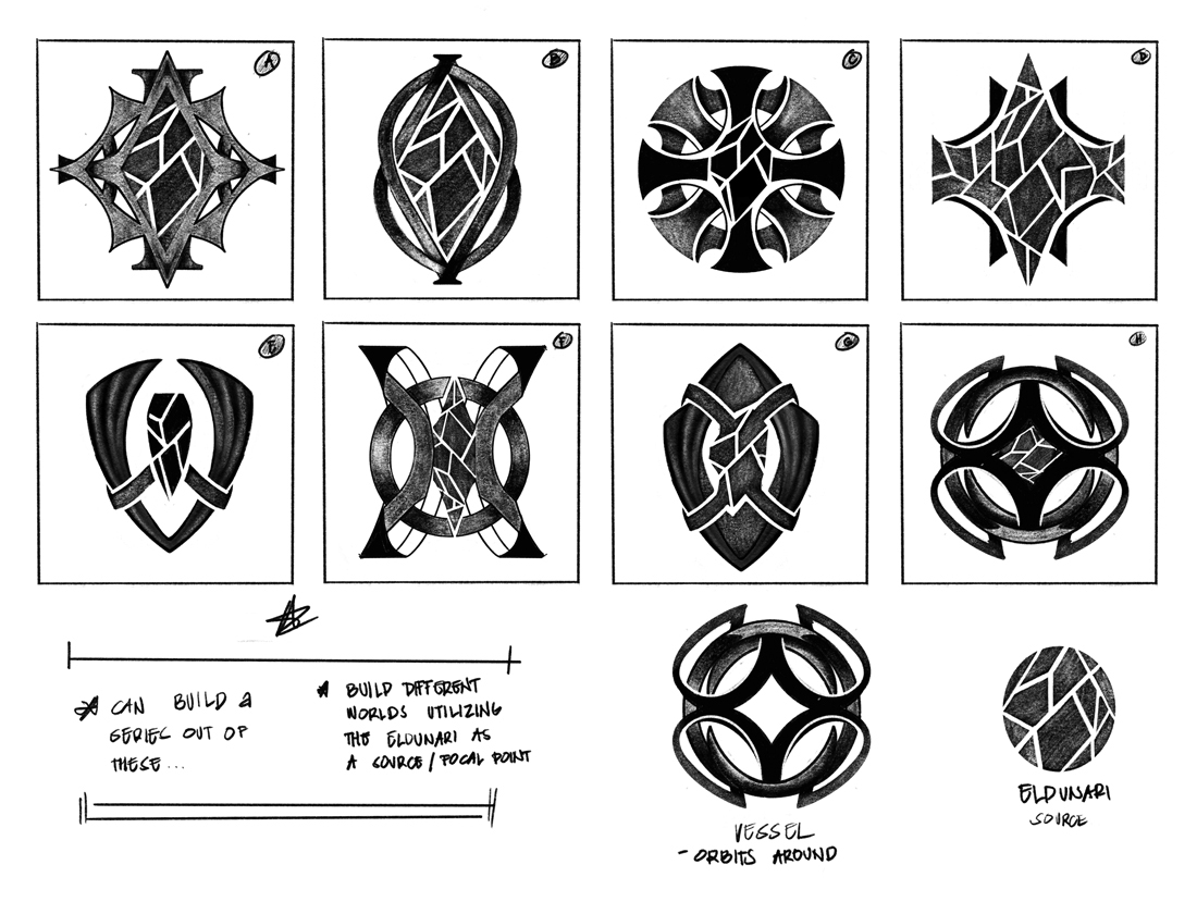
Eldunarí, the source of consciousness
Eldunarí was used throughout the story and plays a pivotal role in the series. For this concept,
Eldunarí is used as a focal point surrounded by forces that orbits around it as a source of life.
For this first pass, we created different ways to showcase how the Eldunir can be dispersed at will.
Also the idea that paths are formed as Eldunir intersects into the World of Eragon
creating myriads of what can be unique Eldunarya.
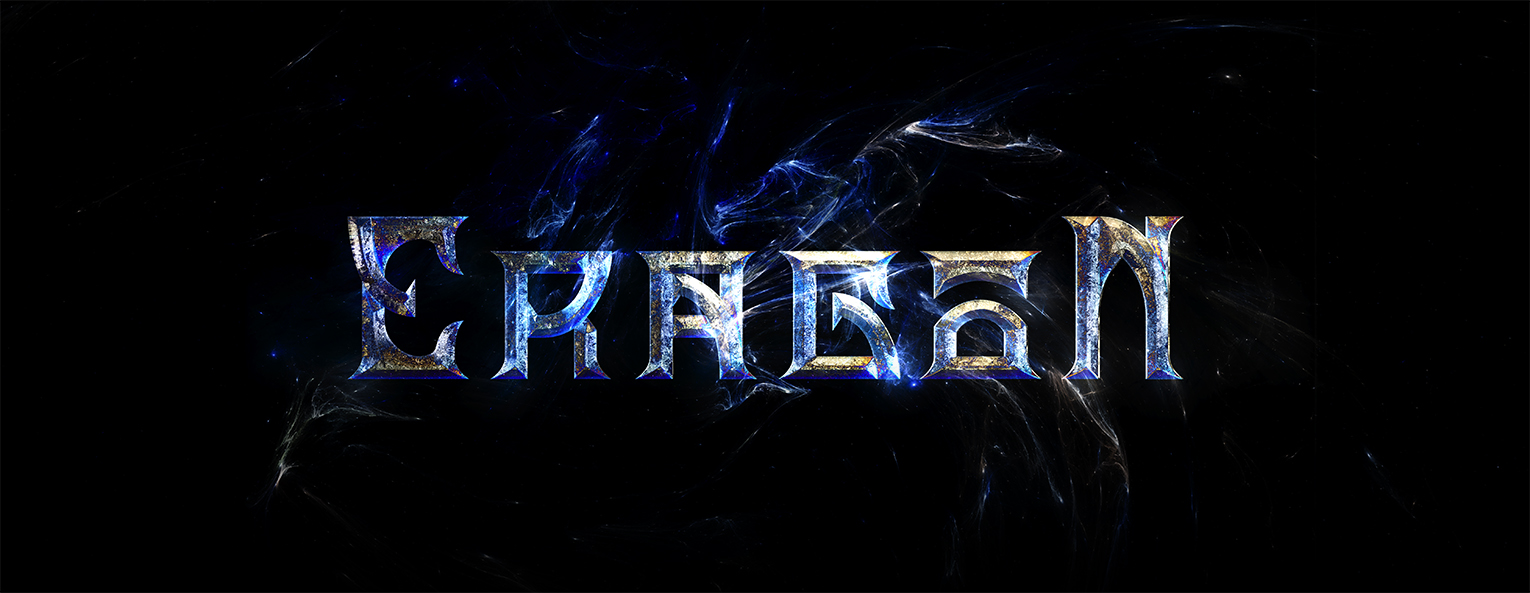
The Font Treatment
Creating a custom typeface that can be a stand alone but still gives the essence of the fantasy realm
was key to the creation of these ideas. The exploration will expand as we move forward to the next stages
of building the world that will go alongside with the logo mark.
The type treatment is an essential part to package the entirety of the project.
I sketched out custom type forms that embodies the narrative’s sci-if and fantasy
look with a sprinkle of magic.